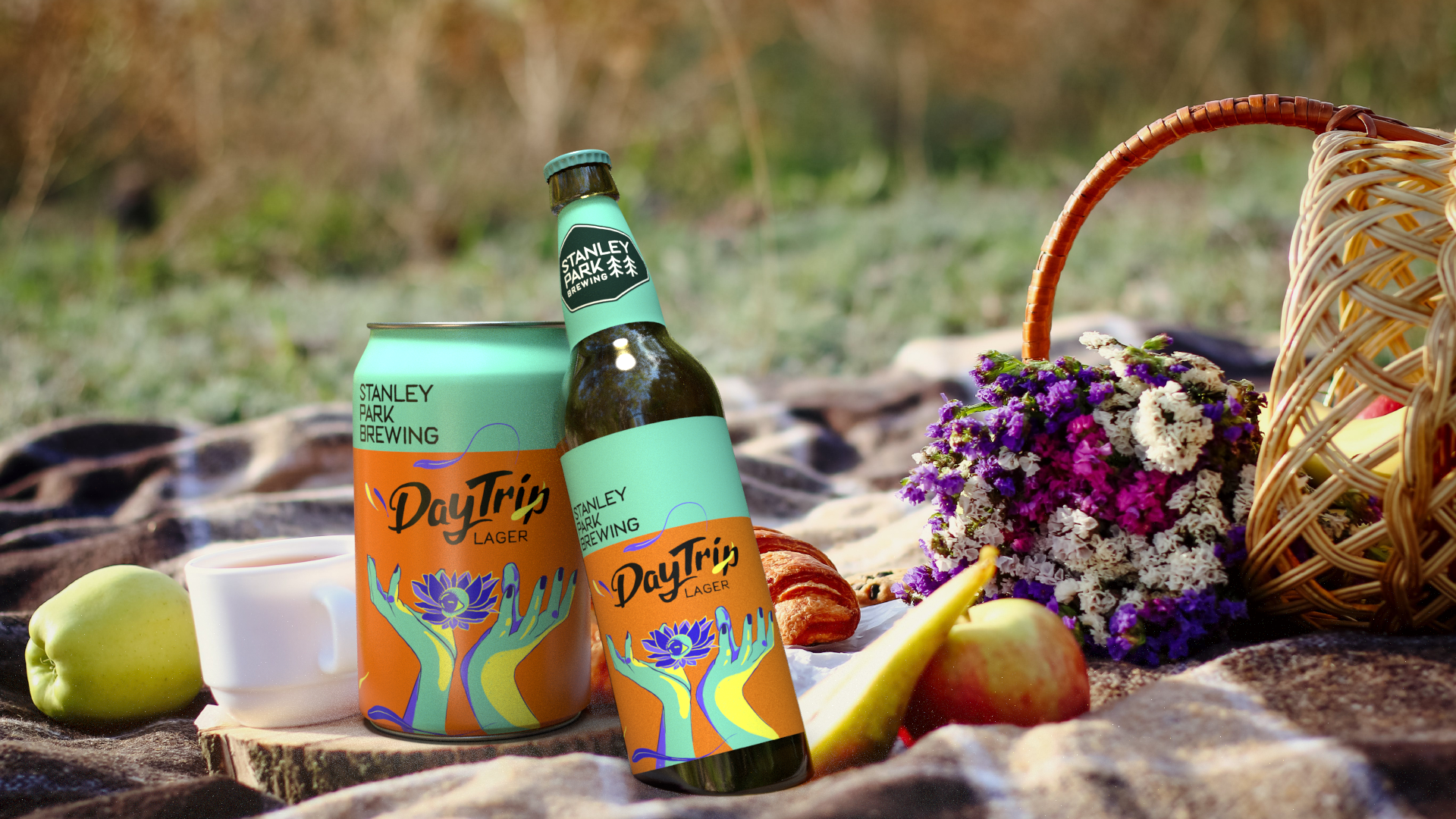
Redesigning the label for Stanley Park Brewing's beer bottles

A light beer. The concept centers around an invigorating experience, evoking feelings of adventure and progress. The illustration features a head opening into a split, symbolizing a journey within oneself. Calmness is depicted by plants emerging from the split, while hands, a lotus, and an eye signify a tranquil awakening. The overall design aims for ambiguity, inviting consumers to embark on a mental trip.
Gender-neutral and refreshing colors were carefully chosen to enhance the visual appeal of the label.


